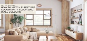
Transforming Environments: The Power of Colour Psychology in Interior Design
Interior design transcends mere aesthetics, aiming to craft spaces that fulfill both our functional needs and emotional well-being. At the heart of achieving such environments is the strategic use of colour. Colour profoundly influences our mood, behaviour, and overall comfort, wielding the power to calm, energize, or soothe. This blog delves into the pivotal role of colour psychology in interior design, offering insights into how colours affect us and how professionals utilize this knowledge to evoke specific emotional responses.
We’ll cover the fundamentals of colour psychology, including the science behind its impact on mood and behaviour and the importance of the colour wheel in making selections. Additionally, we’ll explore how various colours can be used effectively in different rooms, the effect of lighting on colour perception, and how cultural perceptions can influence colour meanings. We’ll also tackle common questions about colour psychology in design. By the end of this exploration, you’ll gain a richer understanding of how colour can dramatically reshape your environment to suit your unique lifestyle and preferences.
- Transforming Environments: The Power of Colour Psychology in Interior Design
- Understanding the Basics of Colour Psychology
- The Colour Wheel Explained
- Colour Associations and Their Psychological Impacts
- Implementing Colour Psychology in Various Rooms
- The Role of Lighting in Colour Perception
- Frequently Asked Questions
- What are the best colours for productivity in a home office?
- Can the colour of a room affect sleep quality?
- How often should I change the colour scheme in my home?
- Are there universal colour schemes that work for any space?
- How can I balance multiple colours in one room?
- Tips for experimenting with colour without overwhelming a space
Understanding the Basics of Colour Psychology
Colour psychology is a branch of psychology that studies how colours affect human behaviour and emotions. It is a crucial aspect of interior design because colour can influence how a space is perceived and experienced. Different colours have different wavelengths, which affect how the brain perceives them. Warm colours like red and orange have shorter wavelengths and are perceived as energizing and stimulating, while cool colours like blue and green have longer wavelengths and are perceived as calming and relaxing.
Understanding Colour Psychology and Its Impact on Interior Design
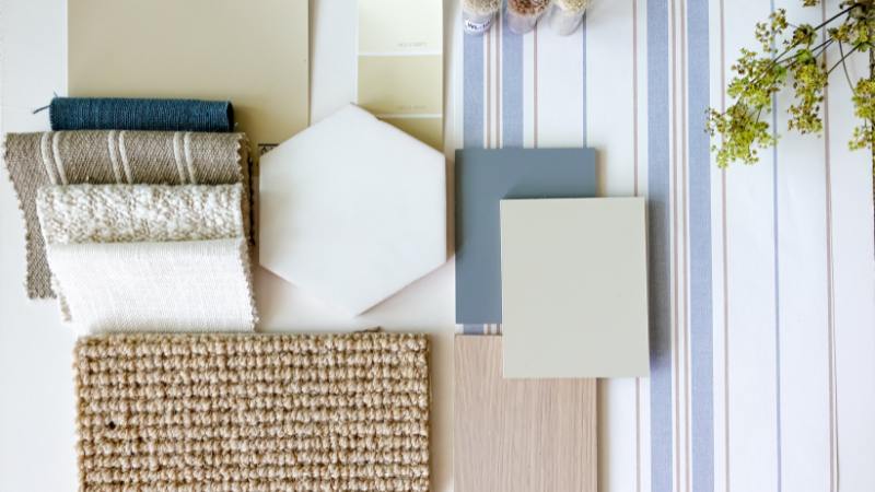
Colour psychology plays a crucial role in the study of how colours influence human behaviour, emotions, and well-being. Within the realm of interior design, the strategic use of colour psychology is pivotal in crafting spaces that evoke specific moods and atmospheres. It’s imperative for designers to grasp the nuances of colour psychology and the colour palette to effectively harness its potential in their projects.
Warm colours such as red, orange, and yellow are employed to instill a sense of energy and vibrancy, whereas cool hues like blue and green are chosen to foster tranquility and relaxation. Through a deep understanding of colour psychology, interior designers can choose right colours to create environments that reflect the desired emotional state and aesthetic appeal.
The Science Behind How Colours Influence Mood and Behaviour
The science behind how colours influence mood and behaviour lies in their impact on the human brain. When light enters the eye, different colours have different wavelengths that affect how the brain perceives them. Warm colours, such as red and orange, have shorter wavelengths and are perceived as energizing and stimulating. These colours can increase heart rate and blood pressure, creating a sense of excitement and energy. On the other hand, cool colours like blue and green have longer wavelengths and are perceived as calming and relaxing. These colours can lower heart rate and blood pressure, promoting a sense of tranquility and relaxation.
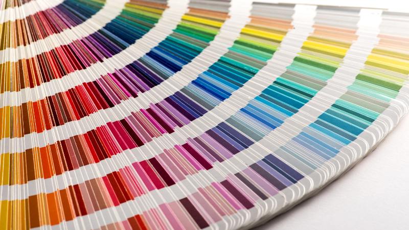
The Colour Wheel Explained
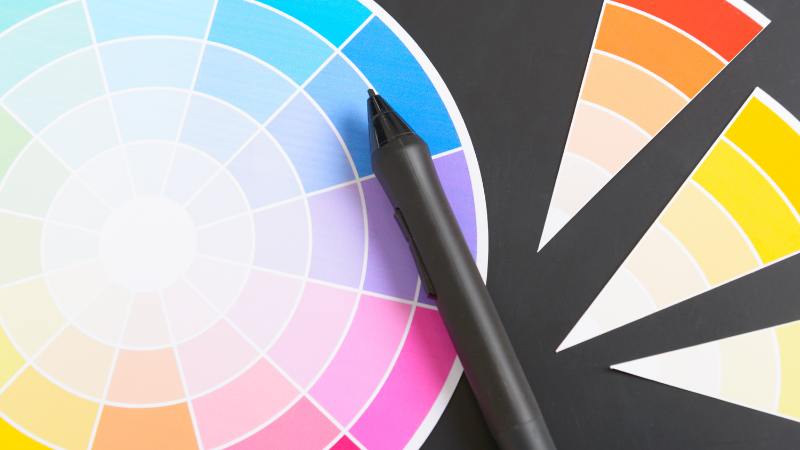
The colour wheel is a useful tool in understanding colour relationships and selecting colour schemes. It consists of primary colours, secondary colours, and tertiary colours. Primary colours, including red, blue, and yellow, are the foundation of all other colours and cannot be created by mixing other colours. Secondary colours, such as orange, green, and purple, are created by mixing two primary colours. Tertiary colours are created by mixing a primary colour with a neighbouring secondary colour.
Primary, Secondary, and Tertiary Colours
Primary colours are the building blocks of all other colours and cannot be created by mixing other colours. They include red, blue, and yellow. Secondary colours are created by mixing two primary colours. They include orange, green, and purple. Tertiary colours are created by mixing a primary colour with a neighbouring secondary colour. They include colours like red-orange, blue-green, and yellow-purple.
Understanding the distinction between primary, secondary, and tertiary colours is crucial as it allows them to create harmonious colour schemes that work well together. By utilizing the different hues on the colour wheel, you can can create a visually appealing and emotionally pleasing environment.
Warm vs. Cool Colours: Their Impact on Room Atmosphere
Warm colours and cool colours have distinct effects on the atmosphere of a room. Warm colours, such as red, orange, and yellow, create a sense of energy, vibrancy, and warmth. They can make a room feel cozy and inviting. These colours are often used in areas where people gather, such as living rooms and dining rooms, to create a lively and energetic atmosphere. On the other hand, cool colours, such as blue, green, and purple, create a sense of calmness, tranquility, and relaxation. They can make a room feel peaceful and soothing. These colours are often used in bedrooms and bathrooms to promote rest and relaxation.
Colour Associations and Their Psychological Impacts
Different colours are often associated with specific emotions and have psychological impacts on individuals. Understanding these associations and impacts is helpful when choosing colours that strategically evoke desired emotional responses in a space.
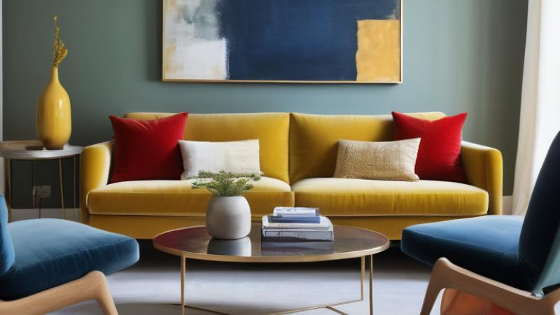
Red: Energy and Passion
Red is a vibrant and powerful colour that evokes feelings of energy and passion. It is often associated with excitement, intensity, and romance. Red can increase heart rate and blood pressure, creating a sense of energy and heightened emotions. It is a stimulating colour that can grab attention and create a focal point in a room.
Red is often used as an accent colour in interior design to add warmth and depth to a space. It can be incorporated through furniture, accessories, or bold accent walls. However, too much red can be overwhelming, so it is important to balance it with other colours and use it sparingly. When used strategically, red can create a vibrant and energetic atmosphere in a room, making it ideal for areas where socialization and activity are encouraged, such as living rooms or dining areas.
Blue: Calmness and Serenity
Blue is a calming and serene colour that promotes feelings of relaxation and tranquility. It is often associated with the ocean, the sky, and water, evoking a sense of peacefulness and serenity. Blue has the ability to lower heart rate and blood pressure, creating a calming effect on the body and mind. It is a versatile colour that can be used in different shades to create different moods and atmospheres. Lighter shades of blue, such as sky blue or baby blue, can make a space feel open and airy, while dark navy blue or royal blue shades create a more intimate and cozy atmosphere.
Blue is often used in bedrooms and bathrooms to promote rest and relaxation. It is also a popular colour for coastal or beach-inspired interior design. By incorporating blue into a space, interior designers can create a sense of calmness and serenity that promotes a peaceful and relaxed environment.
Yellow: Happiness and Creativity
Yellow is a cheerful and vibrant colour that is associated with happiness, positivity, and creativity. It is often referred to as the colour of sunshine and can instantly brighten up a room. Yellow has the ability to evoke feelings of joy and optimism, creating a warm and inviting atmosphere. It is a versatile colour that can be used in different shades to create different effects. Lighter shades of yellow, such as lemon or pastel yellow, can make a space feel fresh and airy, while a dark shade like mustard or golden yellow can create a more dramatic and bold atmosphere.
Yellow is often used in kitchens and dining rooms to create a welcoming and energetic environment. It is also a popular colour for children’s rooms and play areas because of its playful and whimsical nature. However, it is important to balance yellow with other colours and use it sparingly as too much yellow can be overwhelming.
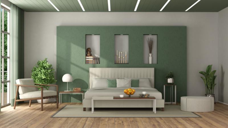
Green: Balance and Growth
Green is a versatile colour that is associated with balance, growth, and harmony. It is often referred to as the colour of nature and can create a sense of serenity and rejuvenation. Green has a calming effect on the mind and body, promoting feelings of relaxation and tranquility. It is a colour that is known to reduce stress and anxiety.
Green can be used in various shades to create different moods and atmospheres. Lighter shades or pale green, such as mint or sage, can make a space feel fresh and tranquil, while deeper and dark green shades like emerald or forest green can add intensity and elegance to a room. Green is often used in bedrooms and living rooms to create a calming and refreshing atmosphere. It is also a popular colour for eco-friendly or sustainable interior design. By incorporating green into a space, you can create a sense of balance and growth that promotes a harmonious and peaceful environment.
Orange: Vibrant and Energetic
Orange is a warm and energetic colour that evokes feelings of energy, enthusiasm, and warmth. It is often associated with the sun and can create a vibrant and lively atmosphere in a room. Orange has the ability to increase energy levels and stimulate creativity. It is a bold colour that can grab attention and create a focal point in a space.
Orange is often used in living rooms and family rooms to create a welcoming and energetic environment. It is also a popular colour for home offices and workspaces because of its ability to stimulate creativity and productivity. However, too much orange can be overwhelming, so it is important to balance it with other colours and use it sparingly.
White: Purity and Simplicity
White is often associated with purity, simplicity, and cleanliness. It is a versatile colour that can create a sense of calmness and spaciousness in a room. White walls are a popular choice in modern interior design as they can make a space feel larger and brighter. White can be used as a base colour and paired with various accent colours to create a specific mood or atmosphere. It is a neutral shade that can provide a sense of security and allow other colours to stand out.
White is often used in minimalist interior design to create a clean and sleek aesthetic. It can also be used to highlight architectural features and create a sense of simplicity and elegance. By incorporating white into a space, you can create a sense of purity and openness that promotes a calm and serene environment.
Grey: Neutrality and Balance
Grey is a versatile and modern colour that is often used in interior design to create a sense of sophistication and neutrality. It is a neutral shade that can provide a sense of balance and calmness in a room. Grey walls and furniture are popular choices in modern interior design as they can create a sleek and minimalist aesthetic. Lighter hues of grey can create a calming and peaceful atmosphere, while most dark shades can add depth and drama to a space.
Grey is often used as a base colour and can be paired with various accent colours to create a specific mood or atmosphere. It is a versatile colour that works well with both warm and cool colour schemes. By incorporating grey into a space, you can create a sense of modernity and simplicity that promotes a sophisticated and elegant environment.
Purple: Luxury and Sophistication
Purple is a regal and luxurious colour that is often associated with royalty, creativity, and spirituality. It is a versatile colour that can create a sense of sophistication and elegance in a room. Purple inspires creativity and promote a sense of inspiration. It is often used in bedrooms and bathrooms to create a calming and relaxing atmosphere. Lighter hues of purple, such as lavender, can create a romantic and feminine vibe, while darker shades, like plum, can create a more dramatic and bold atmosphere.
Purple is also a popular colour for bohemian or eclectic interior design as it can add a touch of luxury and creativity to a space. By incorporating purple into a space, you can create a sense of opulence and creativity that promotes a luxurious and artistic environment, think of a calm but regal effect.
Implementing Colour Psychology in Various Rooms
Implementing colour psychology in various rooms is an effective way to enhance the functionality and atmosphere of a space. Different rooms have different purposes and require specific moods and atmospheres. For example, in living rooms and entryways, warm and welcoming colours like orange and yellow can create an inviting and lively environment. In bedrooms and relaxation areas, calming colours like blue and green can promote rest and relaxation. In home offices and study spaces, energizing colours like yellow and orange can boost productivity and creativity.
Best Colours for Relaxing Bedrooms
For relaxing bedrooms, it is important to choose colours that promote rest and relaxation. Light blue, such as sky blue or baby blue, create a calming and serene atmosphere. These colours tend to make a space feel open and airy, providing a sense of tranquility. Lavender is another popular choice for bedrooms as it is associated with relaxation and tranquility. Soft shades of green, like sage or mint, can also create a calming and soothing environment. These lighter shades can be paired with neutral colours like white or beige to create a serene and peaceful atmosphere.
Energizing Colours for Home Offices and Study Spaces
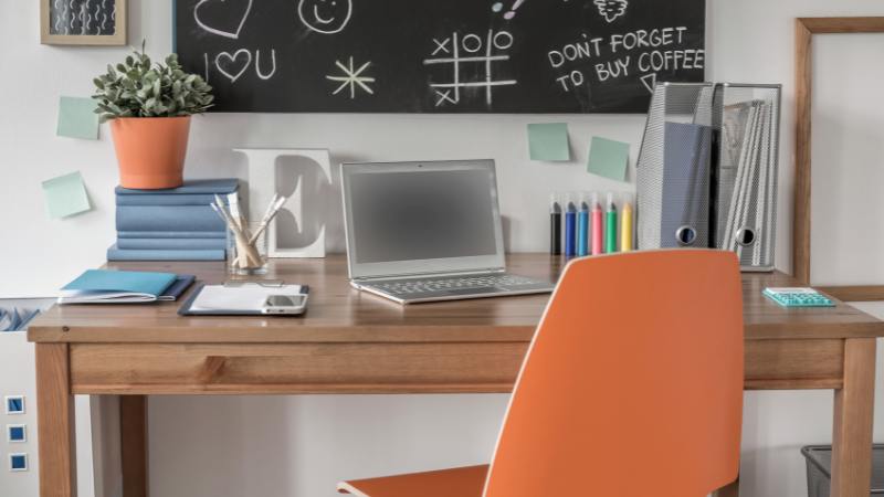
For home offices and study spaces, it is important to choose colours that promote energy and productivity. Energizing colours like yellow and orange can stimulate creativity and increase energy levels. These bold colours can create a vibrant and lively atmosphere that is conducive to work and study.
Red is another colour that can be used sparingly in home offices to add warmth and depth to a space. However, it is important to balance these bright hues with calming colours like blue or green to create a harmonious environment.
Welcoming Colours for Living Rooms and Entryways
Living rooms and entryways are areas of the home where people gather and socialize. Therefore, it is important to choose colours that create a welcoming and inviting atmosphere. Warm colours like orange and yellow can create a lively and energetic environment. These colours can make a space feel warm and inviting, promoting social interaction and conversation. Earth tones like brown or beige can also create a warm and welcoming atmosphere. These colours can be paired with accent colours like red or green to add depth and interest to a space.
The Role of Lighting in Colour Perception
Lighting plays a crucial role in colour perception and can greatly influence how colours are perceived in a space. Natural light, such as sunlight, can enhance the vibrancy and saturation of colours, making them appear more vivid and true to their actual hue. On the other hand, artificial lighting, such as incandescent or fluorescent lighting, can alter the appearance of colours and make them appear warmer or cooler.
Natural vs. Artificial Lighting and Colour Appearance
The type of lighting used in a space can significantly affect the appearance of colours. Natural light, such as sunlight, provides a full spectrum of colours and enhances the vibrancy and saturation of hues. Colours appear more true to their actual hue under natural light. On the other hand, artificial lighting, such as incandescent or fluorescent lighting, can alter the appearance of colours. Incandescent lighting tends to emit warm tones, making colours appear warmer, while fluorescent lighting can create cooler tones, making colours appear cooler.
By leveraging the natural and artificial lighting in a space, you can create a colour scheme that is visually appealing and evokes the desired atmosphere.
Tips for Enhancing Colours Through Lighting Choices
Enhancing colours through lighting choices is an effective way to create a visually appealing and atmospheric space. Here are some tips for achieving the desired colour enhancement through lighting choices:
- Use warm lighting, such as incandescent bulbs, to enhance warm colours like red, orange, and yellow.
- Use cool lighting, such as fluorescent bulbs, to enhance cool colours like blue and green.
- Experiment with different lighting angles to create depth and shadows that enhance colour contrast.
- Incorporate natural light through windows or skylights to enhance colour vibrancy and create a connection to the outdoors.
- Use accent lighting, such as spotlights or track lighting, to highlight specific colours or architectural features in a space.
- Consider dimmer switches to adjust the intensity of lighting and create different moods.
Frequently Asked Questions
What are the best colours for productivity in a home office?
The best colours for productivity in a home office are generally bright and energizing colours. Colours like yellow, orange, and red can stimulate energy and creativity. However, it is important to strike a balance and avoid overwhelming the space with too much colour. Incorporating calming colours like blue or green can help maintain focus and balance in a home office environment.
Can the colour of a room affect sleep quality?
Certain colours can impact sleep quality. Cool tones like blues and greens promote relaxation, aiding in better sleep. Avoiding stimulating colours such as reds and bright oranges is advisable for a restful environment. Understanding colour psychology can enhance your sleep sanctuary.
How often should I change the colour scheme in my home?
To keep your space fresh and on-trend, consider updating your home’s colour scheme every 5-7 years. However, personal preference, lifestyle changes, and design trends can influence the frequency of colour updates. Assess your needs and style periodically to determine when a change is needed.
Are there universal colour schemes that work for any space?
While there are no one-size-fits-all universal colour schemes, neutrals like whites and greys are versatile choices for any space. Additionally, natural hues inspired by elements like earth and sky can create a calming ambiance suitable for various rooms.
How can I balance multiple colours in one room?
Balancing multiple colours in one room can be achieved by creating colour harmony. This can be done by selecting a dominant colour and using other colours as accents or complementary shades. It is important to consider the overall feel and mood of the room and ensure that the colours work well together to create a cohesive and balanced design.
Tips for experimenting with colour without overwhelming a space
When experimenting with colour in a space, it is important to start small and gradually introduce colour. This can be done through accent pieces like pillows, artwork, or rugs. It is also helpful to consider colour psychology and the emotional impact of different colours. By understanding the effects of colour, you can create a vibrant and colourful space without overwhelming the senses.
Interested in getting a custom piece made or a piece of furniture reupholstered? We can do that for you! At Calgary Interiors, we’ve been designing and building furniture since 1962. We have in-house interior designers that can help guide you with fabric choices, fabric colours and knows the top furniture trends and has designed comfortable and stylish pieces.

To receive an estimate regarding your home, commercial, or hospitality project.