As we move into the second year of the decade, the color trends for 2021 are amping up to be a drastic response to a lot of the trends that were slated to define the past year. In 2019, we thought the next decade would be defined by futuristic designs and bright, bold, colors. Then 2020 happened.
In 2021, the color trends you’ll see will largely feel calming and soothing. We’re not going to see a surge of neons or crazy contrasts. Instead, the upcoming color trends are softer and feel like they were picked for humans, not for computers. The past year pushed us to reconnect with our humanity, and in 2021, we’ll see that connection play out visually.
Think harmony, not dissonance. That’s 2021’s color trends in a nutshell. We’ll see lots of single-color designs, muted colors, colors found in nature and palettes that easily blend together. Ready to see them up close? Check out each of these top color trends that will define 2021:
Here are the top color trends for 2021:
- Super-saturated, juicy colors
- Human skintones
- Harmonious, analogous palettes
- Surreal and expressionist color
- Monochrome plus one
- Soothing colors that are easy on the eyes
- Worn & faded-looking colors
- Organically shaped color blocking
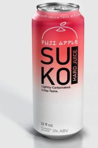
1. Super-saturated, juicy colors
—
One of the color trends we’ll see dominating designs in 2021 are saturated, juicy colors paired with much paler hues in the background to make the intense colors pop.
Brand identity design by Shwin
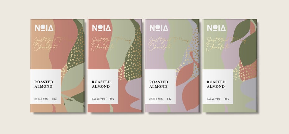
After a challenging year like this one, people are craving positivity, so designers are giving us the cheerful, vivacious corals, magentas and oranges we need right now. These deliciously juicy and rich colors have a rejuvenating and uplifting effect. They are warm, but not hot. Refreshing, not brash.
And the combination with pale pinks and creamy tones creates an intriguing contrast that just works. In these designs, the pale background is as important as the focal color, grounding it and making pop.
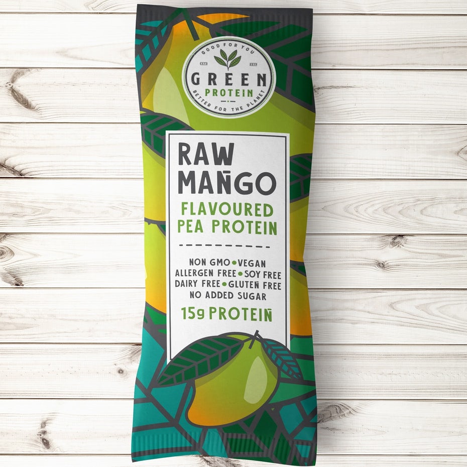
 Product label design by Julia Wolf
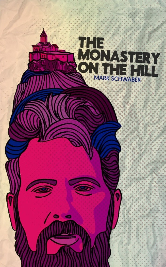 Illustration by Jose Antonio Varela
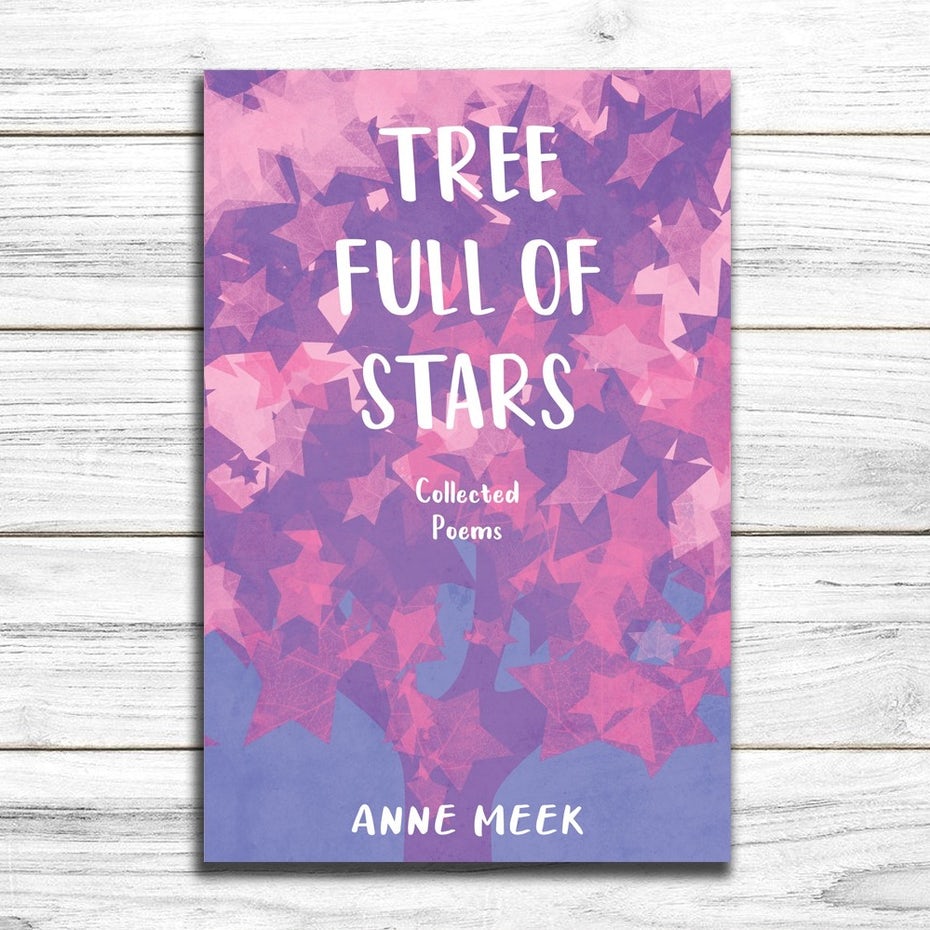
 Book cover design by kostisPavlou
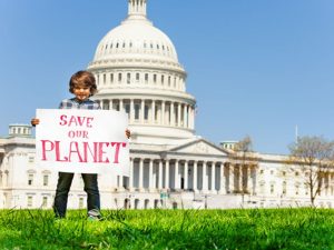
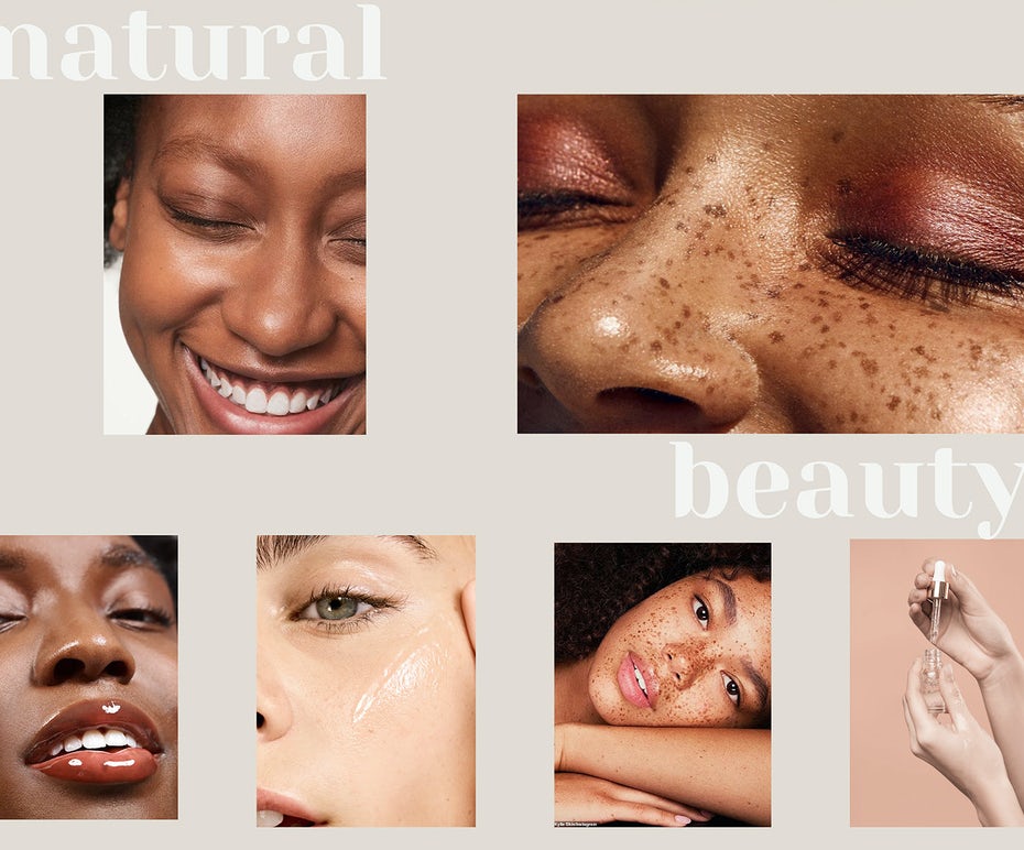
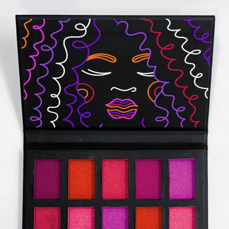
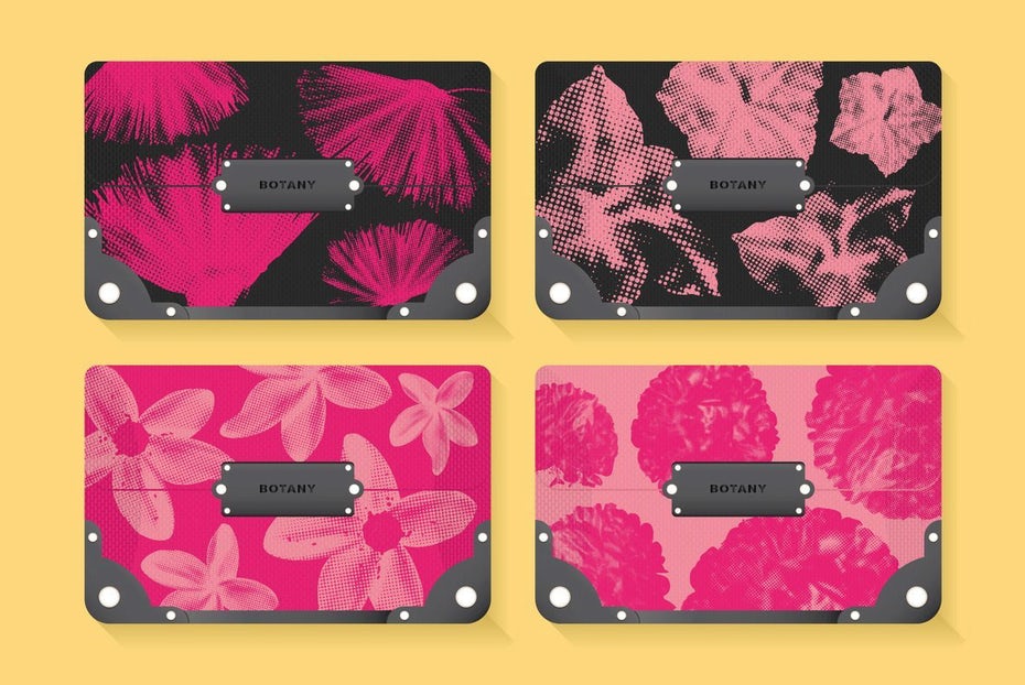
When we said 2021’s color trends feel human, we meant it. One of the biggest color trends coming our way is color palettes focused around the beauty of human skin tones. In 2021, brands and designers are getting under your skin with human-hued designs. And not just a tiny range of human skin tones like we used to see on bandaids and other products labeled “nude” or “flesh-toned”. In 2021, designs will work with every color of our organic rainbow, frequently making one or more human figures the focal point.
 Web design by Natalia Demidova via Behance
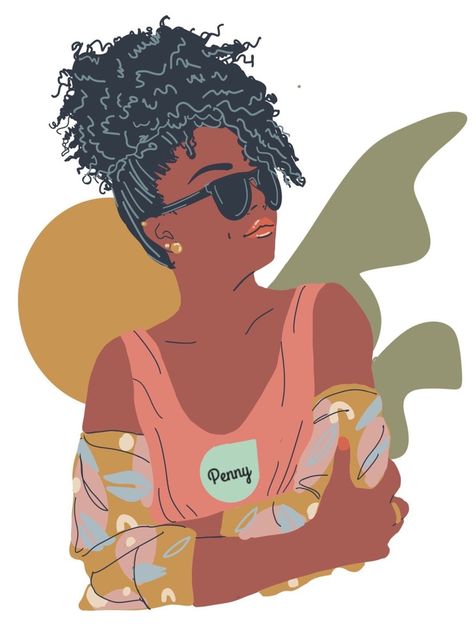 Illustration by Fe Melo
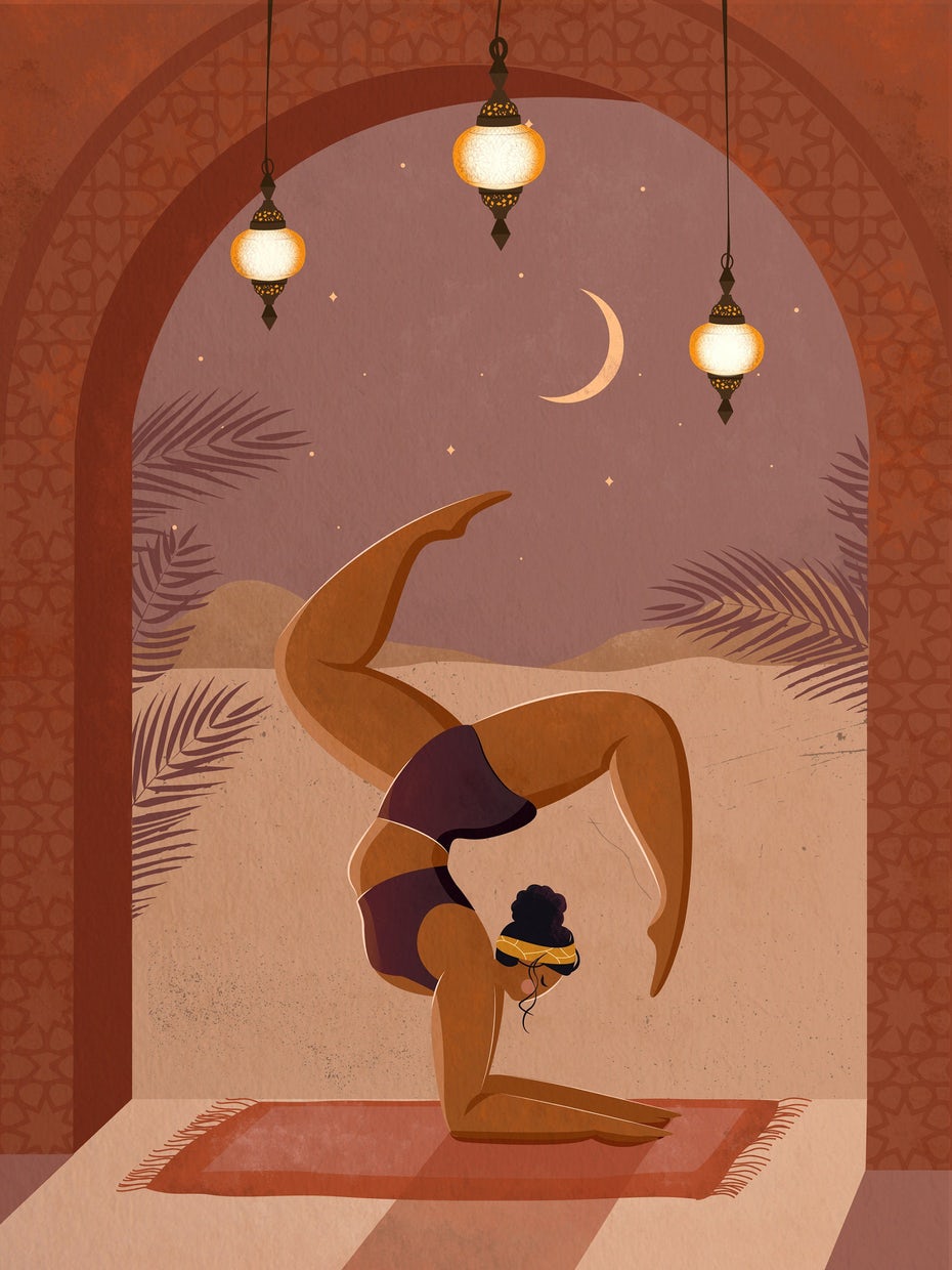 Illustration by Nida Mars
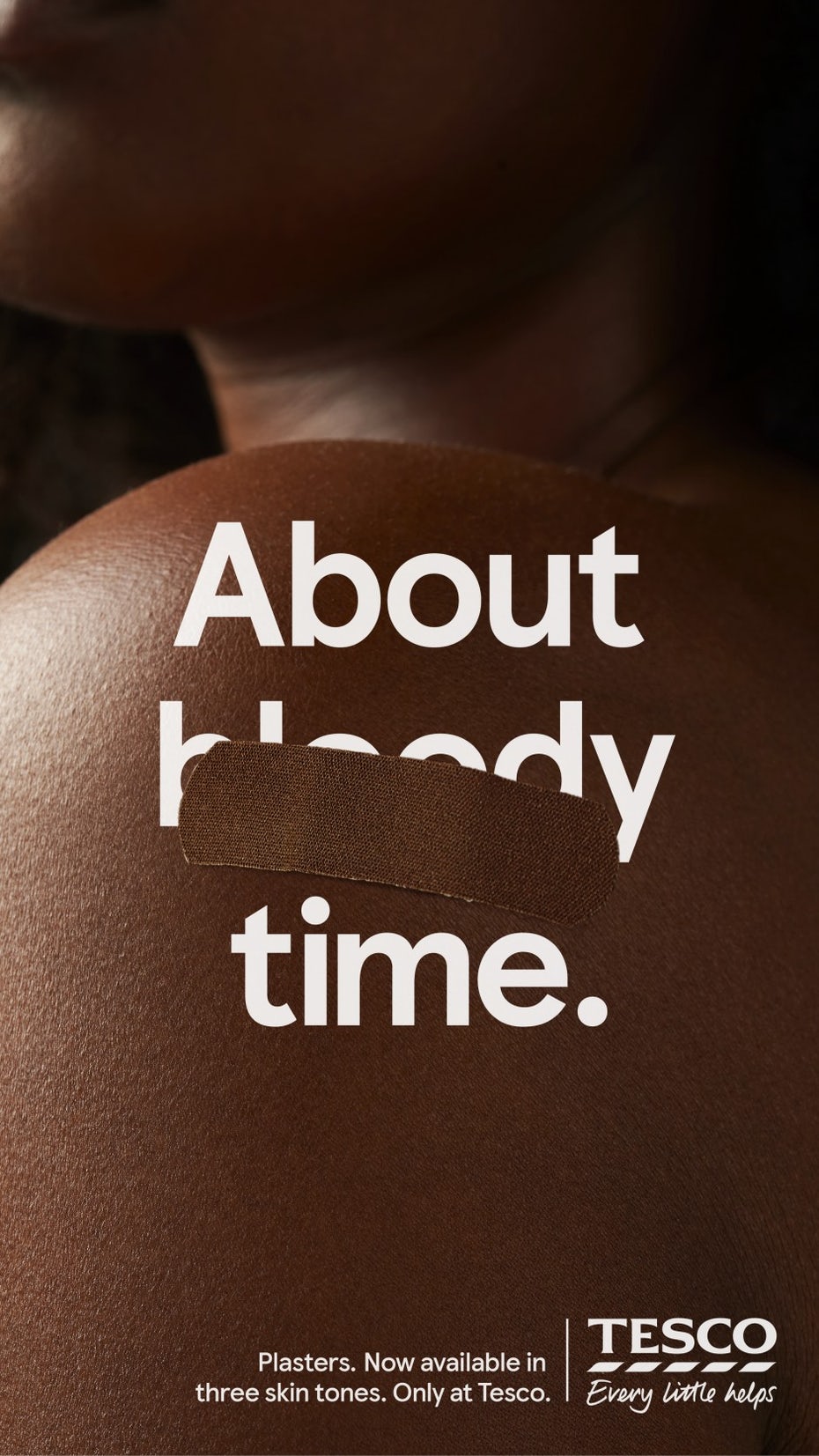 Via Tesco
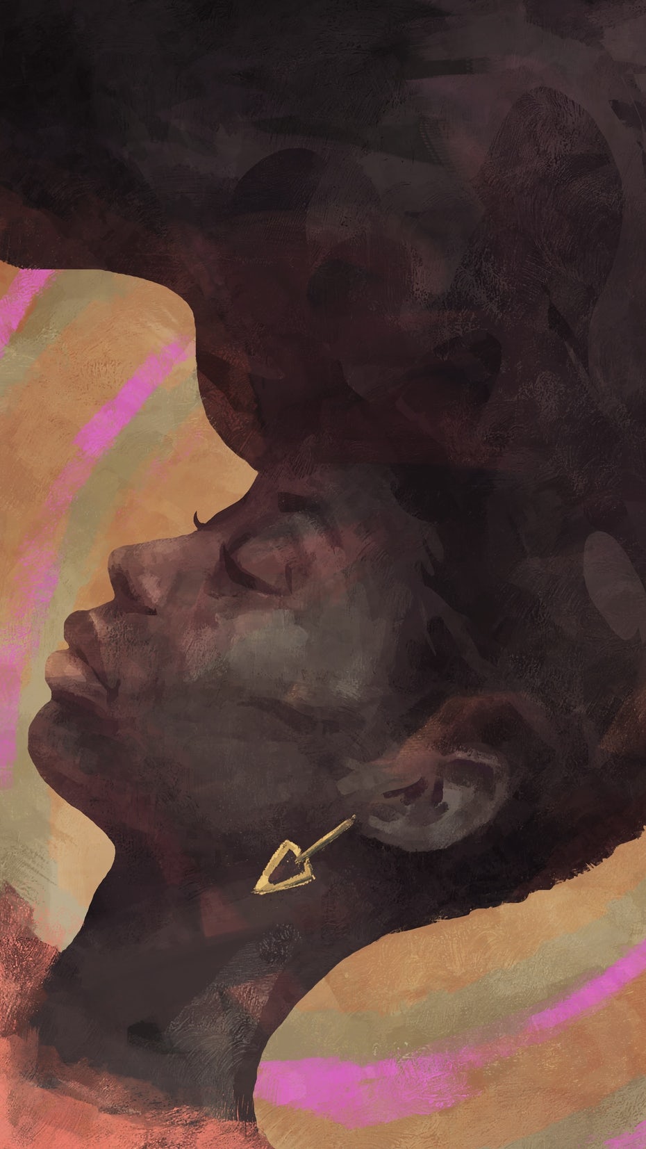 Illustration by jimmyarts
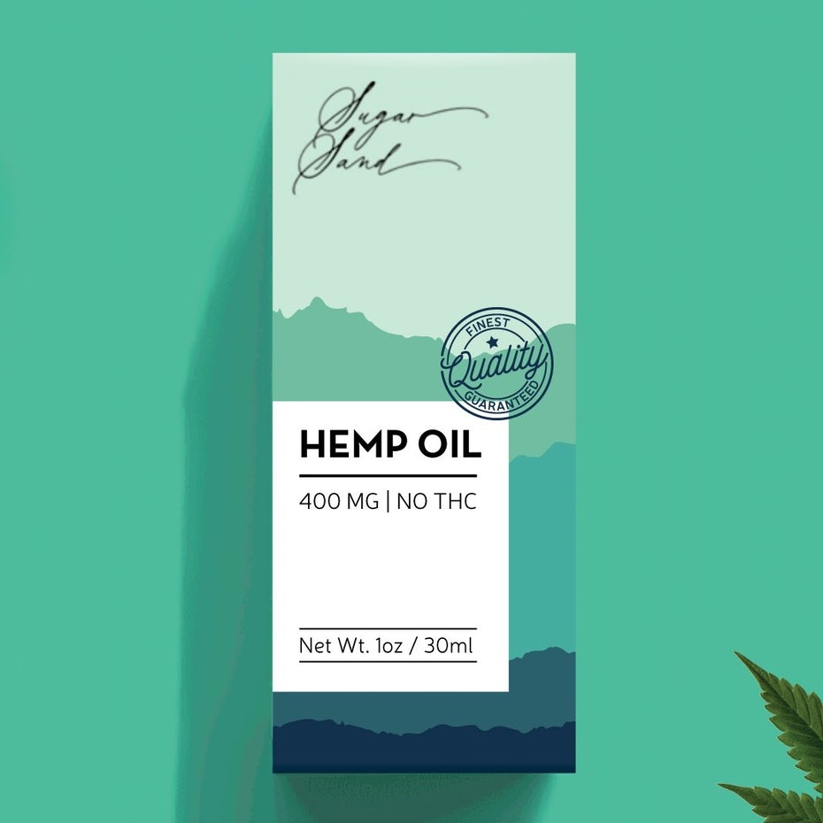
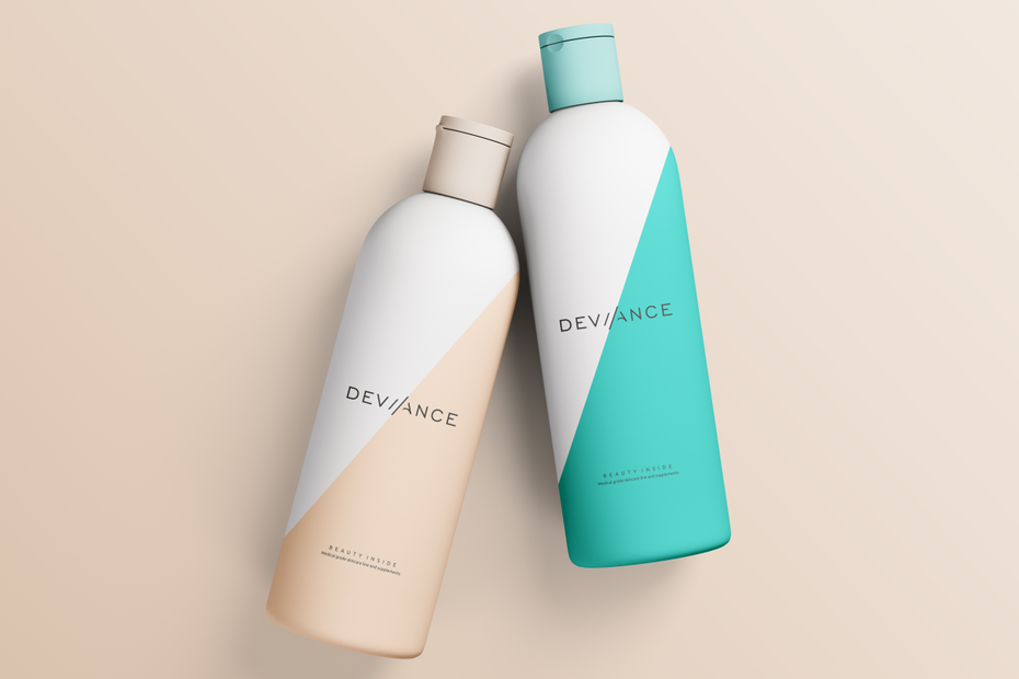
3. Harmonious, analogous palettes
—
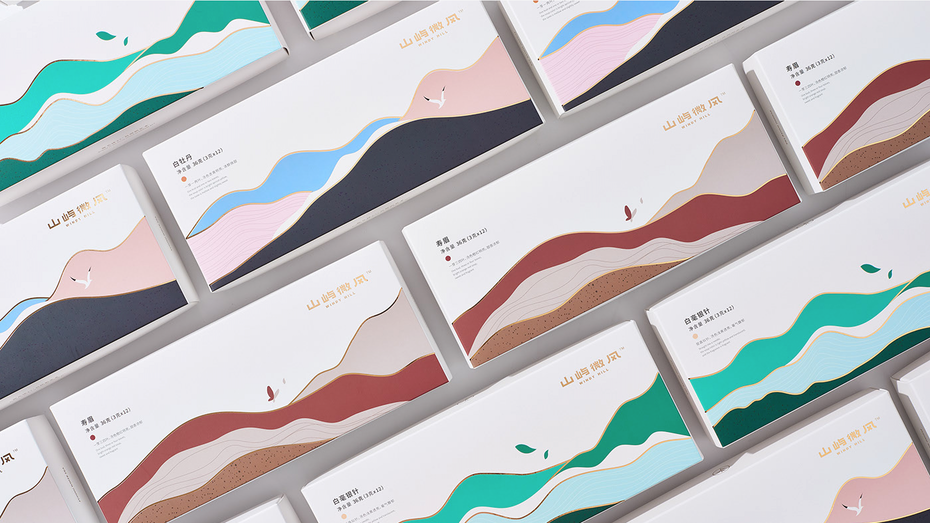
In 2021, people will want harmony. We’ll want the comfort that comes from unity and togetherness, and that will extend to the color trends you’ll see in new designs. One of the upcoming color trends we’ll see a lot of is analogous color palettes; palettes that easily blend into each other.
 Packaging design by Jelena M.
 Logo and branding design by Spoon Lancer
Trends evolve over time, and we’re seeing the gradient trend that has been popular for several years now morph into the analogous palette trend. As you can see, some of these harmonious color palettes are made up of shades of all the same colors while others are collections of shades that are located next to each other on the color wheel. In any case, they create a soothing gradient-like effect, but without the perfectly smooth color transitions we’re used to seeing from gradients.
 By Jammy Ginger
![]() By casign
By casign
![]() By artsigma
By artsigma
 By lliiaa
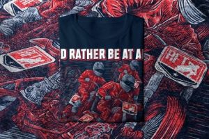
4. Surreal and expressionist color
—
Adding to the list of harmonious, feel-good color trends we’ll see in 2021, we’ll be seeing a lot of designs that use colors in unexpected, even surreal ways to create dream-like images.
 Packaging design by _Ossobuko_
These designs make a statement by coloring objects in colors they normally aren’t. The goal here is to be playful and create escapist landscapes where people can find a few moments of solace away from our challenging reality.
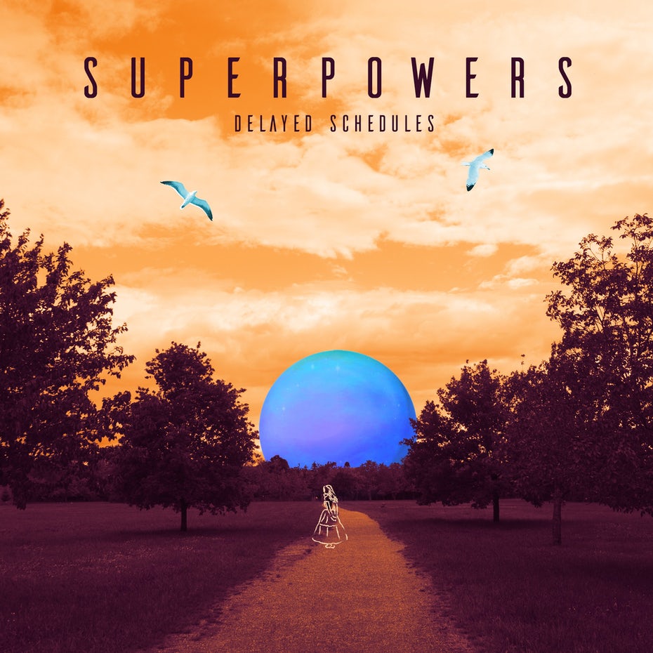 Album cover design by woodenspace
 Merchandise design by Barrios1
 Book cover design by Boja
 Product packaging design by Julia S.
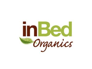
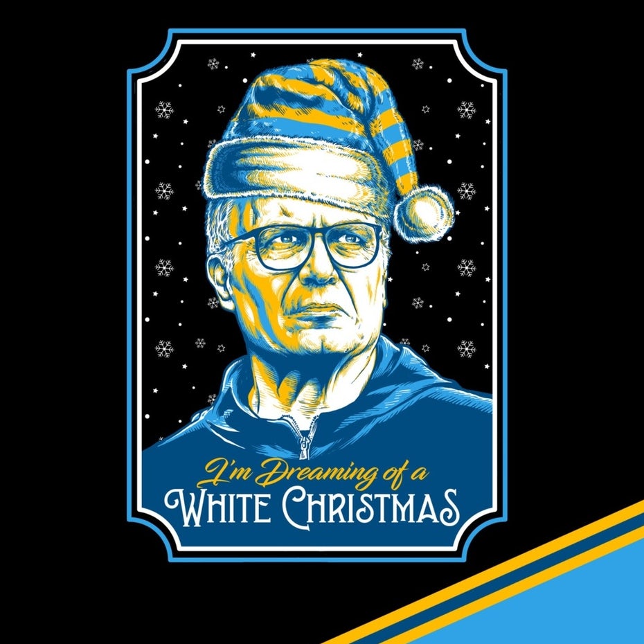
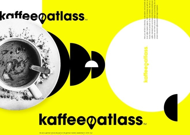
5. Monochrome plus one
—
Monochrome palettes aren’t a new trend—we saw them really picking up steam in 2020. But here’s the difference between a 2020 monochrome palette and the 2021 version: in 2020, monochrome designs relied on using lots of shades of the same color to create depth and visual intrigue. In 2021, designers are dropping single contrast shades into otherwise-monochrome, greyscale designs to create the same effect.
The addition of one expressive, bold shade takes the design into the world of color without making it too colorful—a modern way of keeping things simple while being excessive at the same time.
T-shirt design by Irudh
 Logo and brand design by !s
 By School Studio via Behance
 By Kirsten Collins via Behance
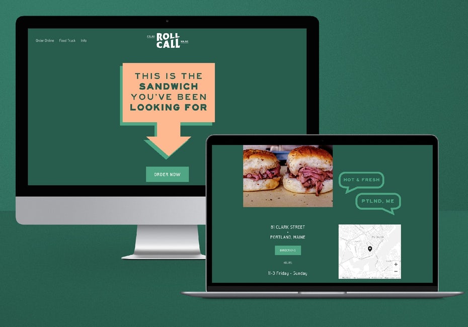
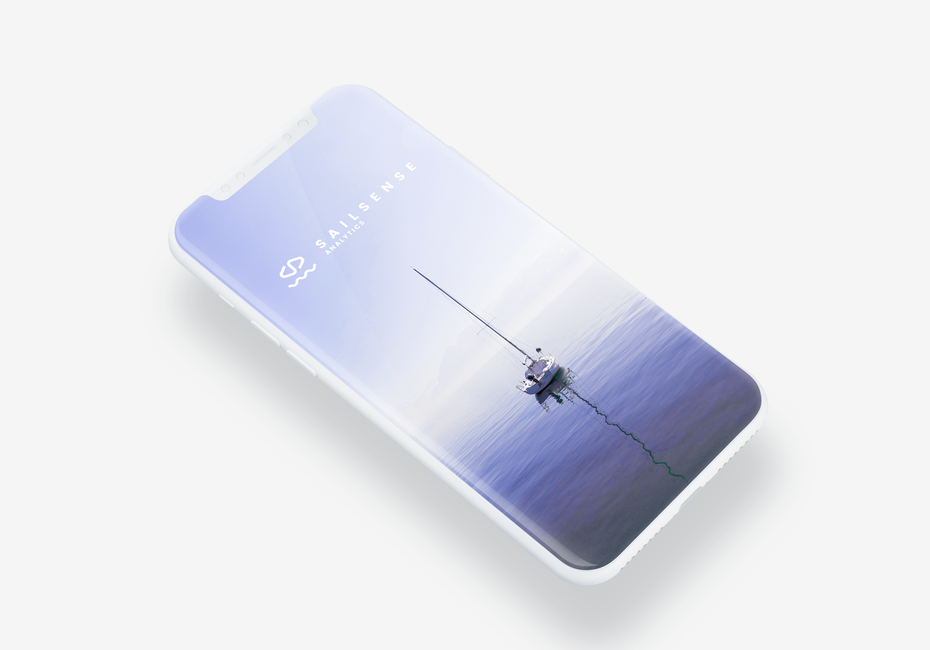
6. Soothing colors that are easy on the eyes
—
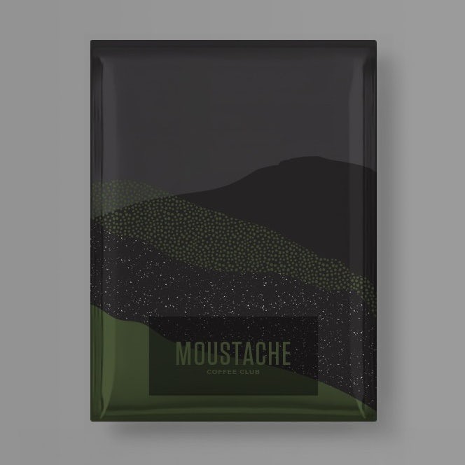
In the past year, we spent a lot of time looking at screens. Sure, okay, we did a lot of that before, but in 2020, the year of Zoom meetings and socially distanced celebrations, we spent a lot of time looking at screens. And we learned that certain colors are a lot more comfortable to look at than others.
In 2021, those comfortable, easy-on-the-eyes colors will be trending. In fact, designs created for ocular comfort in general will be trending. That means subtle, simple designs and lots of cool, natural colors that make it easy to keep watching and scrolling for hours.
 Website design by Nicole Delger
 App design by ozonestyle
 Logo and brand identity design by Ikim
![]() Logo and brand design by anajersey
Logo and brand design by anajersey
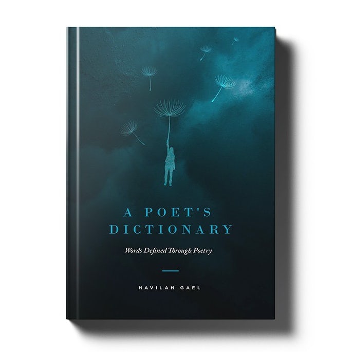
7. Worn & faded-looking colors
—
Another one of the upcoming color trends you’ll be seeing a lot in 2021 is colors that look lived-in. What does that mean, exactly? Think of your favorite pair of jeans or your favorite baseball cap. Their colors are long faded and the stress lines where they conform to your body are bright and visible. That’s exactly what designers are capturing with this trend.
 Poster design by nevergohungry
There’s more to this trend than distressing colors to make them look well-loved. Designers are also using rough, frayed textures to further make objects and images look like they’ve stood the test of time.
 By Chrisb Marquez via Behance
 Logo design by airdesigns24
 Logo design by esuwa
![]() By Simon Stratford via Behance
By Simon Stratford via Behance
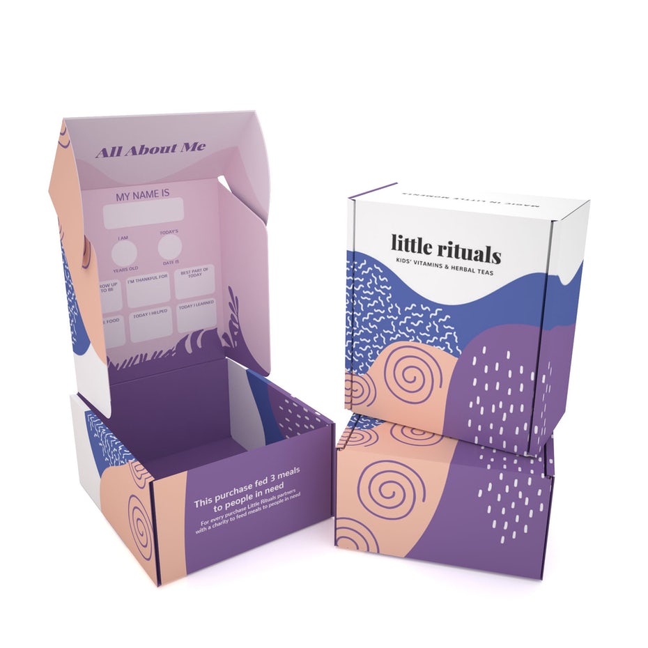
8. Organically-shaped color blocking
—
Organically shaped color blocking isn’t just one of the color trends you’ll see making a splash in 2021. It’s also slated to be one of the year’s top packaging design trends.
 Packaging design by monostudio
The color blocking you’ll be seeing in 2021 won’t be like the color blocking you saw in the 90s. Now, instead of sharp angles and boxes creating a multicolored grid, we’re going to see imperfect, textured, squishy, squeezy-looking shapes working together in complementing colors.
 By Qianlizhang via Behance
 Packaging design by monostudio
 Packaging design by JianBranding™
Get a great (re)design with the biggest color trends of 2021
—
It’s common for trends to develop in response to recent years’ trends and events, and 2021’s color trends are no different. After weathering 2020 and rediscovering what really matters, it’s no surprise the upcoming design trends we’ll see feel so human.
Whether you’re redesigning your current look or launching something completely new, give your brand a human touch by working with one or more of 2021’s color trends.